How can graphic designers communicate across cultural boundaries and promote global understanding ? That's the heart of the subject of this book based on a research preceded by a comprehensive case study on the coexistence of Chinese and Latin as well as Arabic and Latin writing. The study culminates in an examination of the conditions under which the coexistence of diverse writing systems can enhance intercultural visual communication. This theme occupies designers in all cultures whose goal it is to promote global understanding while preserving the diversity of languages and writing systems.
Get your copy online : https://www.lars-mueller-publishers.com/visual-coexistence
Ruedi Baur, Ulrike Felsing (eds.)
Visual Coexistence
Informationdesign and Typography in the Intercultural Field
Edited by Ruedi Baur, Ulrike Felsing, Civic City and HEAD Genève
With contributions by Ruedi Baur, Sébastien Fasel, Ulrike Felsing, Fabienne
Kilchör, Eva Lüdi Kong, Marco Maione, Roman Wilhelm
Design: Ulrike Felsing, Jeannine Moser, Roman Wilhelm
— Ruedi Baur's introduction : "Linguistic and Cultural Interrelationship (p5-p11)"
Even if the languages mentioned do not correspond to those of our study, the “Pierre de Rosette,” by Champollion [see fig. a] is the emblematic object of the research described in this book, as more broadly multilingual inscriptions. The history of its decoding shows how a simple inscription allowed gradual access to a secret civilization. But this Egyptian stone also allows us to address a question more directly related to our research: that of the differences between the symbolic values of the different writing systems. Indeed, this support includes the same decree formulated in three character systems but only two languages. Alongside the text in ancient Greek, which helped Champollion to decode it via Coptic, the Egyptian text is written in both hieroglyphic and demotic form. While it seems almost normal to us that the same sign system can serve several languages as Latin writing, this tablet shows that oral expression can also be translated into different character systems. Our exchanges of texts, using glyphs, which often replace or complement our written expressions, should nevertheless make us aware of these possibilities. They show that the different systems are part of the same language and are not necessarily part of a simplification process in which the new one replaces the old one. Rather, they are parallel systems of expression, each linked to a particular symbolism or use.
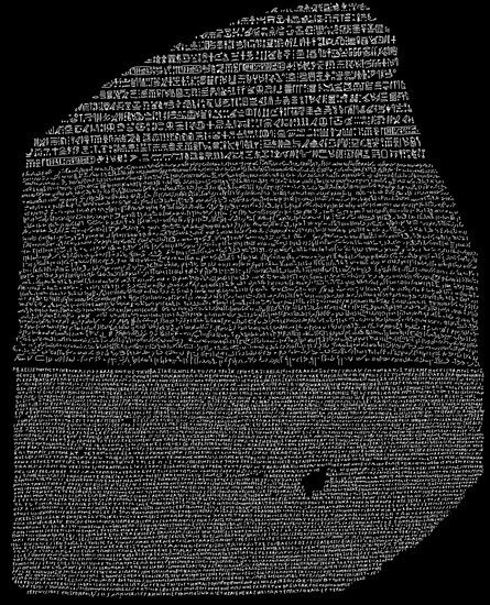
fig. a: The Rosetta Stone
Knowing that the process of filiation between hieroglyphic and demotic scriptures is now proven, it seems unlikely that we were faced with two communities of receptors each hermetically sealed to the other’s writing. Would it not be more appropriate to mention a symbolic complementarity between its two modes of expression? Indeed, the first hieroglyphic inscriptions in ancient Egypt exceeded, in ancient Egypt, only interhuman exchanges. Pharaohs addressed the gods with these ceremonial writings. This exchange could only enhance their own earthly power. On this Rosetta Stone, as on other bilingual or trilingual legal texts discovered since then in Egypt [01], hieroglyphic signs probably have less the function of transmitting a content than that of giving an officiality to the subject by linking the subject to the power of the pharaohs and that of the gods. The writing system makes the subject official, while the demotic text shows on the contrary that the content concerns the people and has a constitutional dimension common to the whole society in question, including those speaking Greek [02].
This observation therefor allows us to complete Barbara Cassin’s reflection on translation: If “the different languages produce different worlds of which they are both the causes and effects” [03] the writing systems of the same language and even the different ways of typographically treating a text influence these imaginaries. Indeed, just as the expressions of a face, a body or the tone of the voice influence the content of an oral declaration, the written word is not devoid of symbolic values related to the drawing of characters and graphic dispositions. In this sense, the decoding of this historical text reveals not only the relationship between words whose meaning could have a certain gap in each language, but also the symbolism intrinsically linked to the writing system as well as within them as a mode of graphic expression. In this sense, our research is part of awareness, still very incomplete, of the untranslatable [04], not linguistic, but of the symbolic worlds linked to writing families and the cultural uses of their typographical and graphic expressions
The beginnings of this research date back to the late 1990s. We had, within the framework of an exchange between the system design class that I headed in Leipzig and a graphic design class at the Central Academy in Beijing, tried to establish a “semiotic dialogue” at a distance, which should be based solely on the image [05]. This experience allowed us to confront the symbolic differences between these two cultures. In choosing the notion of a gap, we are referring to the approach of the philosopher François Julien [06] for whom “going through China is an attempt to develop an oblique, strategic grip, taking European thought in reverse, on our unthinking. That is to say, what we think about and, by the same token, we do not think about” [07]. Thus, if we suspected that the symbolism and the meaning of colors, for example, could vary between the two cultures, the idea that the whole symbolic syntax is constructed in China on the relationship between elements and not on the signifier of a figure called more fundamentally into question what we would tend to consider as universal. The perception of these differences does not only shake up our unthinking, but it also introduces the need for semiotic translation where the belief that our Western reading of signs and
symbols would naturally be shared by all prevails.
By choosing to confront multilingual inscriptions, in the context of our first SNSF research entitled “The coexistence of Chinese and Latin characters,” we did not only wish to analyze the formal effects of these typographical frictions of different writing systems but also to understand the semiotic fields that were thus brought together [08]. The graphic designer knows how much the choice of a character design affects not only the quality of the reading but also the symbolic frame. Although the Helvetica character and its equivalents in the stick family seem, especially in Switzerland, to be a kind of universal pass, one of the purposes of typography is to give form to a message by matching the appearance of the letters and their arrangement to the content of the text. In this sense, the choice of character design, their arrangement in the space of the surface of the support, their colors too, are far from neutral. While they make reading easier, they also convey an atmosphere by confronting us with particular semiotic fields. A little like in music, various “typographical interpretations” of the same text are therefore possible, some will reinforce the content of the text, others will reinterpret it, or even betray it. This dimension rarely remains integrated into linguistic reflections. It is interesting, for example, to note that even the semiologist Umberto Eco, who in his book on translation experiments quickly mentions these interpretations by calling them “different substances,” limits their values to simple “aesthetic” choices [09]. Like other philosophers, he refutes the fact that typography may have the ability to modify the perception of the content of a text. One of the most beautiful demonstrations contrary to this thought is certainly the book by the philosopher Jacques Derrida, which was composed by the graphic designer and typographer GüntherKarl Bose in Gothic characters [10]. A demonstrative act to prove that even a humanist text can be crushed by the symbolic weight of this font associated with the horrors of Nazism. On the contrary, the experience of a typographical reinterpretation of a Nazi propaganda poster in a modernist character in use today shows that, in this new form, hate speech is becoming commonplace and unfortunately seems very similar to that of the current nationalist parties [11]. Another example that brings us closer to our research theme: trying to choose a font for an article on my work published in a Shanghai design magazine, I was naturally attracted in my choice by fonts that kept the gesture of the brush in their expression. While I read in these calligraphic interpretations a contemporary elegance, all proposals in this direction were rejected by my Chinese friends, because they perceived in these signs all the weight of history, which they wished to overcome. The convergence of several sign systems on the same supports, therefore, raises not only the question of the typographical arrangement between character families whose formal syntaxes diverge but also the preservation of semiotic expressions which, although the meaning is the same, may, as we have seen, not respond to the same perception [see fig. b].
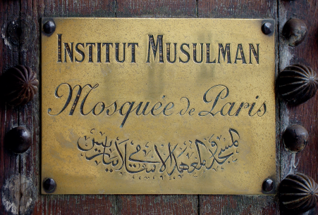
fig. b: Inscription on the Great Mosque in Paris
In the case of multilingual expression, it is therefore not only a question of ensuring the proper formal cohabitation of signs sometimes coming from different writing families, but also of understanding the symbolic dimension of each of the typographical interpretations as well as their combination, knowing that these symbolic dimensions differ from one culture to another. While these differences remain relatively small as long as we remain in the designation of real objects, they become important as soon as words designate concepts. Various workshops on topics related to notions such as pollution, innovation or peace showed that our Greek and Latin landmarks were being undermined by forms of thought based on completely different models that, if taken seriously, would open up real alternatives to our ways of thinking and representing.
As our investigations progressed, particularly around the notions of calendar orientation, the understanding of the use of Chinese characters as a syntax of a thousand-year-old information design culture became clearer. If in our Western schemes the texts legend allow to read by a complementary contribution the illustration, the Chinese sign participates intrinsically in the visual representation, it is information, to the point that without its presence the graphic often loses its meaning. Its disposition, its relationship to other signs, is part of the signifier. To understand and translate certain representations, it is therefore not enough to change the language texts but to translate the images. From this understanding, a new SNSF research was required [12]. It made it possible to account for a gap that was still unsuspected. The one about the explanation using knowledge visualizations. Can we not even think that the Chinese writing system based on signs bearing their meaning in them encourages spatial representation where the abstract structure of Latin writing will quite naturally favor linear description? In one case the Chinese character actively participates in the scheme, in the other he comments on it. A symbolic barrier is placed between text and image. Moreover, our work of translating these Chinese graphics consisted in replacing the Mandarin signs with figures that allowed us to restore the text based on the Latin syllabic structure to its traditional role of explaining the image with legends.
In order not to remain confined to the mere comparison between two cultures, it seemed essential to us at the end of this research to make this multilingual encounter more complex by enriching the research axis with a third writing system linked to a new symbolic space. The introduction of Arabic into our research had several advantages. First of all, it placed the question of typographical ornament in lateral tension between the Chinese “textgraphic” on the one hand and the “linearity-abstract” of the Latin characters on the other. A comparative analysis of the use of this writing system from Morocco to the Muslim provinces of the Chinese Empire also shows the meeting points between the various systems, to the point of meeting Arabic calligraphy taking vertical forms in Asia. It was important for us in this phase of the research to go beyond the homogeneous approach of these systems by mapping the differences existing within each of them and especially by identifying the points of influence that could link them [13]. We are aware that the plural world we are calling for will not be achieved through the selfish withdrawal of societies into themselves. In the context of the growing interdependence of our cultures, as well as the massive disappearance of the languages of our planet, it seems necessary to better understand the relationships but also the differences between the modes of expression, both visual and verbal. Those from distant cultures now meeting on the same communication media. Those that allow us to perceive alternatives to our dominant ways of thinking. Medicine, long before other disciplines, understood that behind each linguistic disappearance a whole therapeutic culture was erased. But it is sometimes within the same language, still very much alive, even dominant, that the semiotic particularities disappear. Our research on the signs of peace [14] has shown that symbolic diversity is even more at risk than language diversity.
Evidence: the modes of expression of a culture are not only related to the oral language and their written transcription. Gestures, rituals, ways of thinking, syntaxes, uses and meanings of signs, representations allowing one to imagine the same concepts, emblematic figures, constitute the foundation of each cultural particularity. In the context of the extreme domination of Western culture and modes of expression, it seems essential not to reduce cultural plurality to the mere preservation of linguistic heritage. If behind the disappearance of a language, an entire culture is destroyed, inversely the way of thinking that covers all aspects of life, health, elsewhere, exchange and becoming. At the same time, even the most isolated of cultures is now in an interdependent relationship with others, informed and influenced by them. It is no longer a question of devoting oneself to one of them without taking into account all those interacting with it. In a sense, it is on this transcultural link that our research has tried to act, certainly with clumsiness, or even worse with remnants of this colonial thought so deeply rooted in our Western societies.
Ruedi Baur, December 2018
-
1
In particular the Canope Decree which concerns, among other things, the introduction of a solar calendar including 365¼ days.
↳ -
2
The symbolic dimensions of ceremonial writing were studied in our books La loi et
↳
ses conséquences visuelles and Don't brand my public space.
Ruedi Baur, La loi et ses conséquences visuelles, Textes: Baur R., Thiery S., Legendre P., Heiz A.W., Lars Müller Publishers, Zurich, 2005.
Ruedi Baur, “The Noticeable Absence of a Flag of the Earth, in Don't Brand My Public Space.” Lars Müller Publishers, Zurich. Text Baur, R., Absence noticed of the flag of our planet, pp. 68–128. The book is the result of research developed at Ensad and HEAD – Genève, 2013 -
3
Barbara Cassin, Éloge de la traduction, Compliquer l’universel, Ouvertures, Fayard, Paris 2016, p. 48
↳ -
4
“Untranslatable are symptoms, semantic and/or syntactic, of the difference in
↳
languages, not what is not translated, but what is constantly (not) translated.”
Ibid., p. 54. -
5
Bogen Nr. 9A Visueller Dialog, Beijin-Leipzig Prof. Ruedi Baur and Prof. Yu
↳
Binnan, 1998.
Project in which Ulrike Felsing, a student in the system design class at HGB, Leipzig, participated -
6
“The gap reveals itself to be a figure, not of identification, but of exploration, not of arrangement, but of disturbance, thus making appear, not an identity, but what I will call a fertility”.
↳
François Julien, Il n'y a pas d’identité culturelle, Éditions de L’Herne,
2016. -
7
François Julien, L’écart et l’entre : Leçon inaugurale de la Chaire sur l'altérité, Éditions Galilée, 2012
↳ -
8
“The coexistence of Chinese and Latin characters,” started in 2010 and completed in 2012. Founded by the Swiss National Science Foundation. See pages 12–59 of the book.
↳ -
9
Umberto Eco, Say almost the same thing. Translation experience. Éditions Bernard Grasset Paris, 2003, p. 304.
↳ -
10
Jacques Derrida, Meine Chancen, Verlag b&b, 2000
↳ -
11
Experience developed at the Design2context Institute (2004–2011) ZHdK Zurich.
↳ -
12
Funded by the Swiss National Foundation, October 2012–September
↳
2015. See pages 60–283 of the book. -
13
Unfortunately, this third phase of the research, which brought together
↳
typographers and calligraphers from all over the Arab world, did not receive
the support of the SNSF. It is still looking for financial support. -
14
Baur, R. Signs for peace : an impossible visual encyclopedia. Baden : Lars
↳
Müller, 2012